Engagez
Making a strong first impression with streamlined onboarding
Project basics
Shipped
Cross-functional team
Redesign
Tools
Figma, Figjam

Engagez is a B2B revenue marketing software company. As the sole designer on this project, I worked closely with Engagez's CEO and CTO to arrive at the solution.
First impressions count
Users who follow a call to action on Engagez' marketing site can explore the product by creating their own free "venue," a customizable hub for community, content, and events.
The venue creation flow is a chance to get potential customers excited about trying the product. However, the existing solution failed to take advantage of this opportunity.
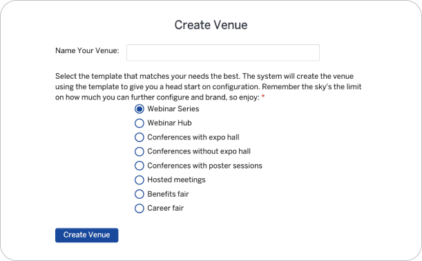
The original venue creation flow.
Issues with the existing design
Distracting layout
Factors including center alignment, horizontally stacked text entry fields, inconsistent UI patterns, and poor visual hierarchy disrupt the user’s flow and contribute to a disorganized experience.
Inconsistent navigation
Users can't count on navigating easily - the "next" button moves around the screen with each step in the process. Plus, there’s no progress indicator, so users don't know if the task will take 2 or 20 minutes.
Confusing content
The descriptive text is wordy in some places, and sparse in others. The consequences of certain choices are unclear—for example, users can select a venue template, but the differences between the templates aren't explained.
Lack of brand continuity
This flow is many users’ first interaction with the product after arriving from the marketing website. The mismatched branding and visual style between these two locations risks confusing users and compromising the legitimacy of the brand.
Extraneous steps
A confirmation step has been added to catch users who are trying to log into their account, not create a venue. While addressing a problem, this also adds time and mental load to the user experience.
My first step toward an improved user experience was to reconsider the user flow in order to streamline the experience and minimize the steps required.
Exploring the "what ifs"
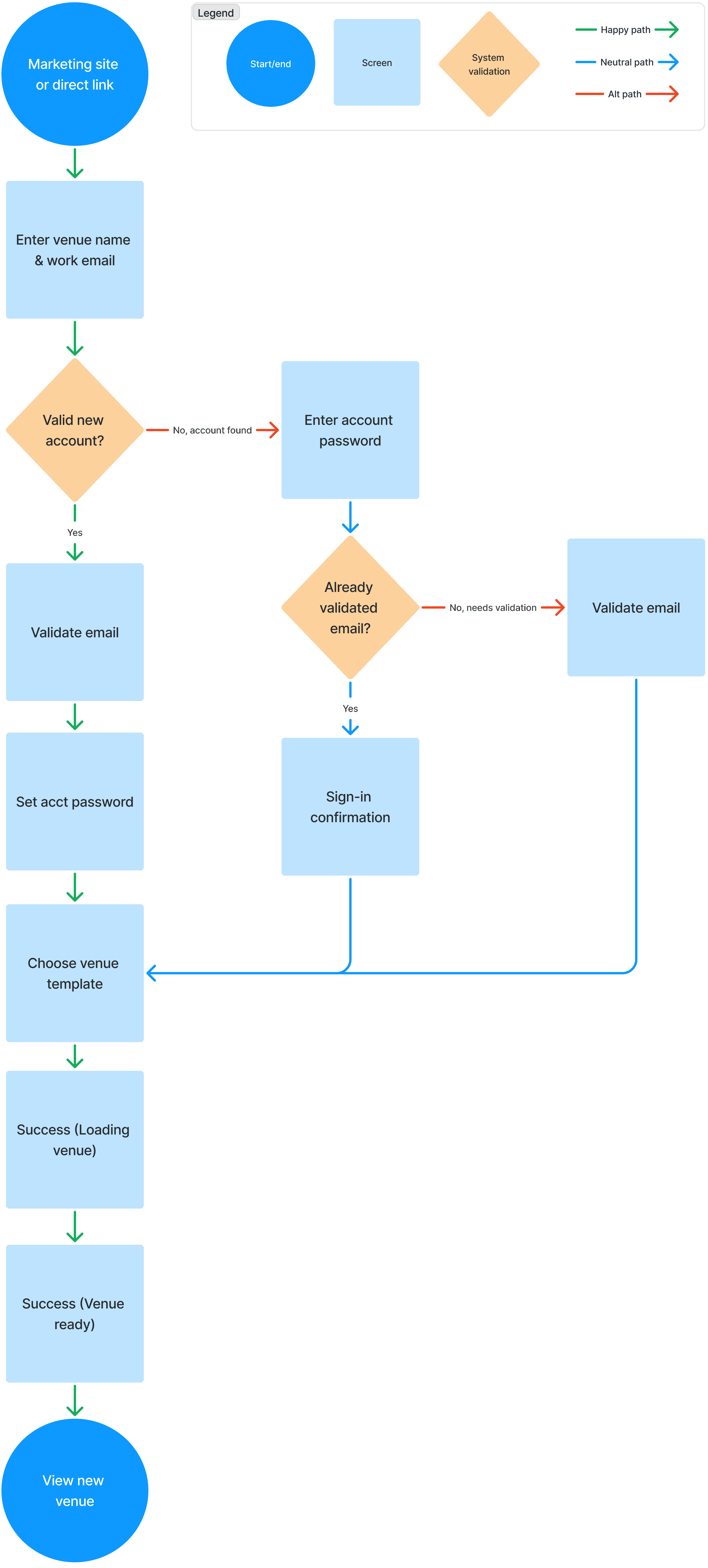
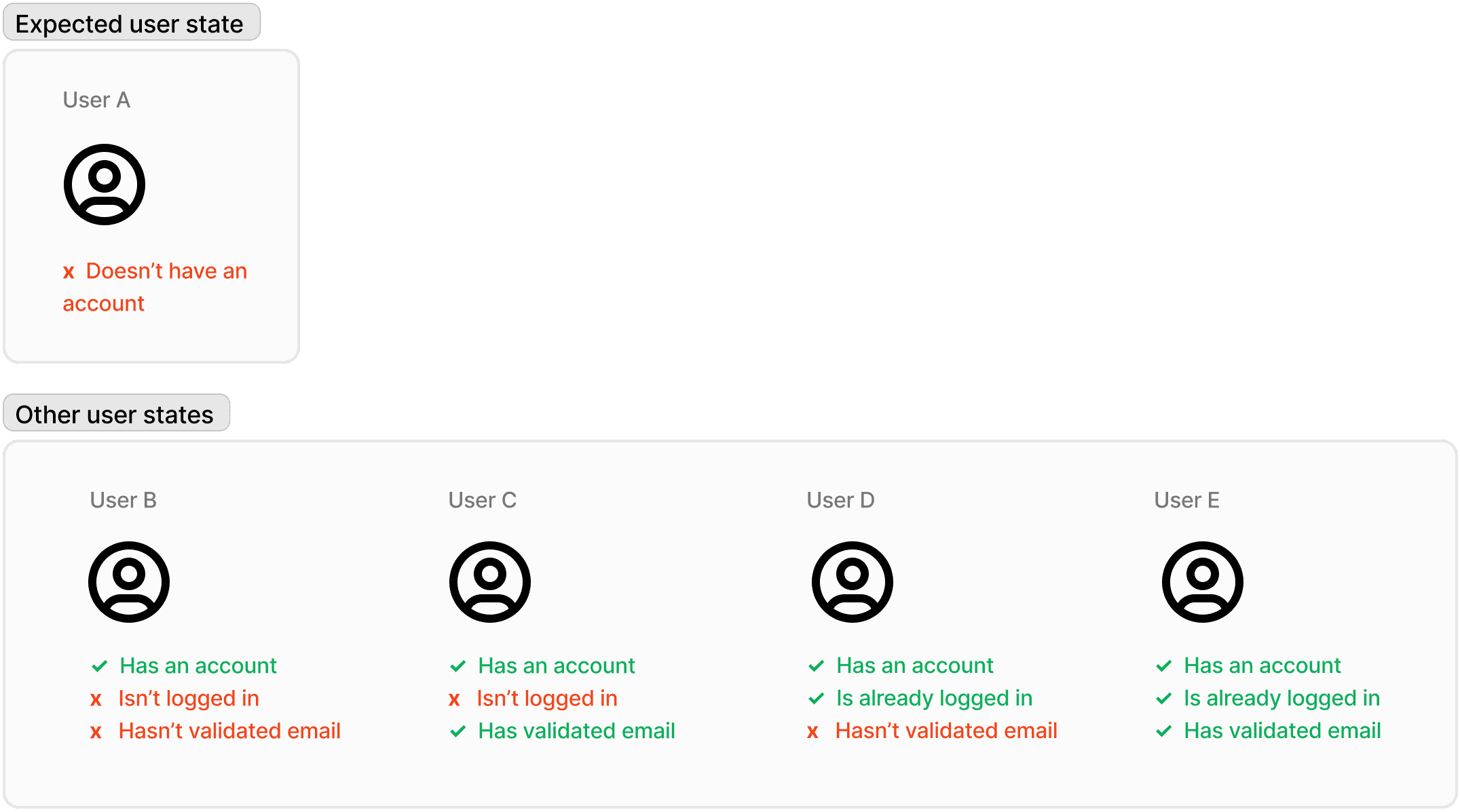
Many people who begin the onboarding process are new users, but some may already have an account. The existing design had checks in place to account for these edge cases, which I would need to preserve despite reordering the steps of the flow.
Fleshing out the new flow
After brainstorming alongside the team, we settled on a plan for the improved user flow. (The diagram below illustrates the process for a user who is not already signed in.)

Designing a complex choice
With the basic structure of the feature defined, I considered the details of user interaction.
To create a new venue, the user must select a template tailored to their use case. Previously, they were given an overwhelming, contextless list of options, making the impact of each choice unclear.
I set out to design a selector that would help users make an informed decision, without becoming overwhelming.
Developing brand continuity
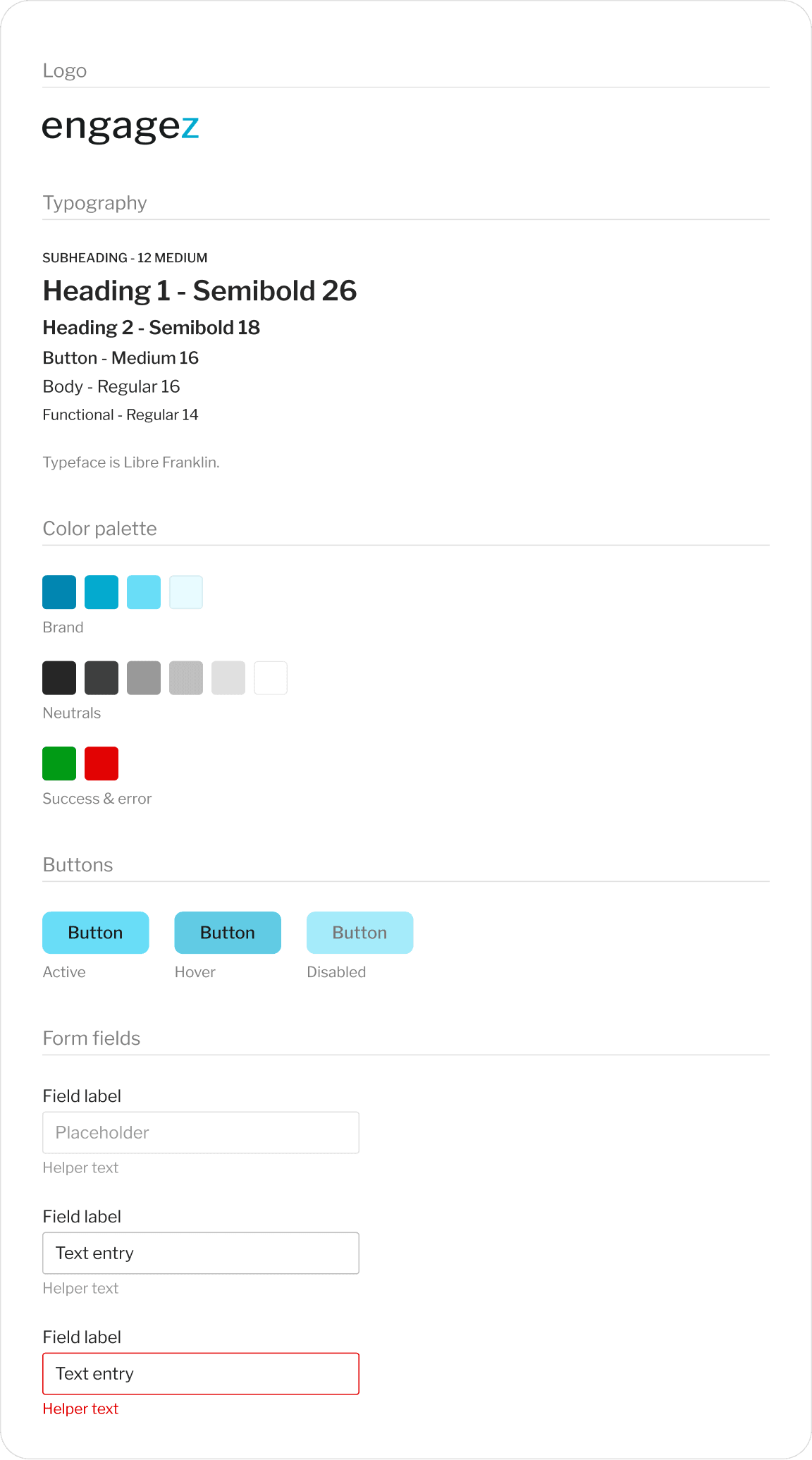
The onboarding flow bridges Engagez's marketing site and its product, which have differing branding and visual styles. As a team, we agreed that this feature should provide a smooth visual transition between the two destinations.
The style tile below shows the visual design of the feature.
Try it out yourself! You can explore the improved feature via this Figma prototype.
What makes the new version work?
Familiar, low-friction interactions
The new design utilizes best-practice design patterns for forms, such as left-alignment, vertically stacked fields, and consistent styles.
Simple navigation
The "continue" button is always in the same spot. And thanks to a progress indicator, users are reassured that venue creation is a quick, easy process.
Helpful content
The copy, while minimal, is used strategically to set users' expectations and provide important information. The tone is conversational, reassuring, and avoids technical jargon.
Visual continuity
The venue creation flow is now consistent with the branding and design on the marketing website, while also providing a smooth visual transition into the product experience.
Back to the top!


